amp Fitness
Industry
Health & Fitness
Client
amp Fitness
Service
Product Design
Date
2025-2026
amp is an AI-powered strength-training system that combines connected hardware with a personalized digital experience. Its wall-mounted device delivers adaptive resistance, while the app guides workouts, tracks progress, and connects members with expert coaching.
As Senior Product Designer, I led end-to-end product design across amp’s core app experiences, partnering with product, engineering, research, and leadership to turn complex hardware and training logic into clear, motivating, and cohesive experiences.
Selected Work:
01 · Workout Together
A shared training experience that lets two people take turns using one amp device.
02 · Live Activities
Lock Screen experiences that keep workouts, progress, and motivation visible beyond the app.
03 · Teams
A social ecosystem connecting members through profiles, activity feeds, teams, and leaderboards.
04 · amp Pro Subscription
A streamlined subscription and activation journey across individual and household accounts.
05 · Profile Redesign
A progress-focused profile bringing identity, achievements, and workout activity into one place.
06 · Rest Experience Redesign
A clearer system for rest periods, transitions, and complex workout states.

Workout Together: Turning a solo workout into a shared experience.
amp was originally designed for individual training, but many users were already working out alongside a partner, friend, or family member.
I led the end-to-end design of Workout Together, a shared strength-training experience that enables two people to train side by side using one amp device, alternate seamlessly between sets, and stay aware of whose turn it is and what comes next.
The opportunity: Couples, friends, and family members often wanted to train together in the same space, but the existing experience supported only one active user. This forced them to improvise outside the product, making shared workouts feel disconnected and difficult to follow.
The opportunity was to make training together feel intentional and motivating, while preserving the structure, clarity, and personalization of an individual workout.
Key product decisions: The first release focused on strength workouts and a shared-device experience, allowing us to introduce the feature without adding unnecessary complexity.
I adapted the existing workout logic to support two users, refined the transitions between turns, and adjusted timing patterns so each person had enough time to switch positions and prepare. Existing interaction patterns were preserved where they supported the shared rhythm and simplified where they introduced friction or confusion.
At the end of each workout, performance data and total weight lifted were attributed separately to each participant. If the partner already had an amp account, their results were automatically added to their personal activity data. If they were new to amp, the post-workout experience became an acquisition opportunity: they received an email with their results, along with an invitation to join the app and continue tracking their progress.
This connected the shared workout experience to both long-term progress tracking and organic user growth.

Live Activities: Bringing motivation beyond the app.
Building a consistent workout routine depends on more than what happens inside the app. Users may intend to train, but without a relevant reminder of their goals and progress, that intention can easily fade throughout the day.
I led the end-to-end design of amp’s Live Activities, bringing personalized workout cues directly to the iPhone Lock Screen. The experience used contextual progress and motivational messaging to reconnect users with amp at the moments when an extra push mattered most.
The opportunity: amp already had the information needed to motivate users: their planned workout days, weekly goals, and active streaks. However, these commitments were only visible after opening the app.
The opportunity was to turn the Lock Screen into a lightweight extension of the product, helping users stay connected to their routine without introducing a new flow or requiring them to actively check their progress.
Rather than relying on generic reminders, each experience needed to reflect the user’s current context and make the next action feel immediate, personal, and achievable.
Key product decisions: I designed three contextual Live Activity states, each targeting a different behavioral trigger:
- Workout Day: reinforced routine by reminding users when a planned training day had arrived.
- Weekly Goal: highlighted progress and encouraged users to close the remaining gap.
- Streak at Risk: introduced urgency and loss aversion when an active streak was close to breaking.
Each state dynamically adapted to the user’s schedule, completed workouts, weekly target, and remaining time. The content was intentionally glanceable, using a clear hierarchy and a single motivating message rather than recreating the full amp experience on the Lock Screen.
The visual system extended amp’s product language into iOS while remaining native to the platform. Progress indicators, countdowns, and contextual copy helped users understand their status immediately, while tapping the Live Activity took them directly to the relevant experience in the app.
Following the launch, average weekly app sessions increased by 25%, demonstrating how a small, contextual surface outside the app could meaningfully strengthen engagement and workout consistency.
Teams: Turning individual progress into shared momentum.
amp had a strong individual workout experience, but progress largely remained personal and isolated. Users could complete workouts, build consistency, and improve over time, yet they had limited ways to share that progress, connect with others, or feel part of something bigger.
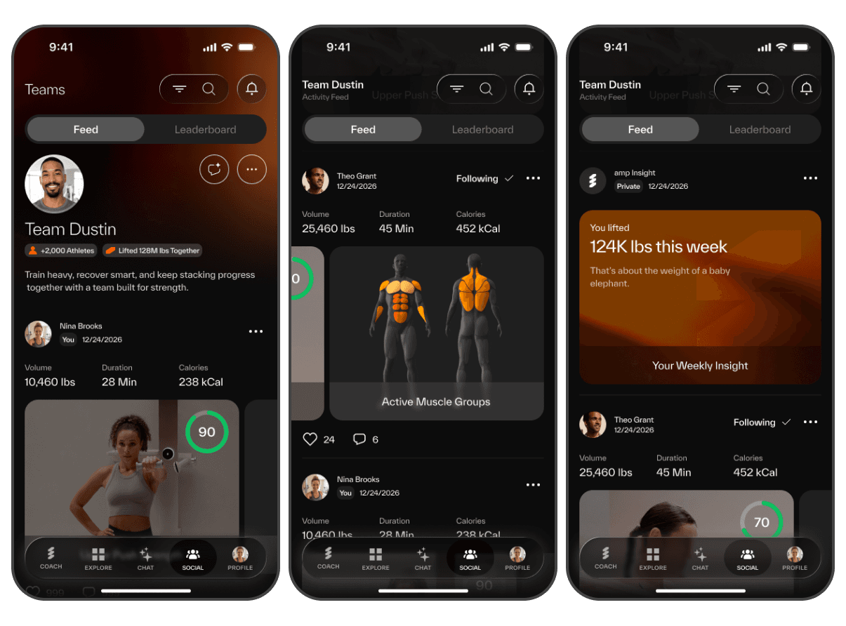
I led the end-to-end design of Teams, amp’s social platform for connecting users through shared activity, community, and friendly competition. The experience brought together a personalized activity feed, team spaces, public profiles, notifications, and leaderboards to create new reasons for users to return between workouts.
The opportunity: Fitness motivation is often shaped by the people around us. Seeing someone else train, celebrating a milestone, or moving up a leaderboard can reinforce progress in ways that individual tracking alone cannot.
The opportunity was to build a social layer around amp’s existing workout data without turning the product into a noisy or generic social network. The experience needed to feel motivating and fitness-focused, while giving users control over what they shared and who could see it.
Key product decisions: I structured the experience around two complementary behaviors: connection through the Feed and motivation through the Leaderboard.
The Activity Feed transformed completed workouts into engaging, easy-to-scan stories. Workout cards combined personal content with meaningful training data, including duration, weight lifted, calories, performance scores, and active muscle groups. Weekly insights added another layer of context by turning progress into memorable and shareable achievements.
Each team had its own identity, description, member count, and collective progress, creating a stronger sense of belonging beyond individual performance. Users could explore activity from teammates, follow other members, interact with posts, and move naturally between the Feed, profiles, and rankings.
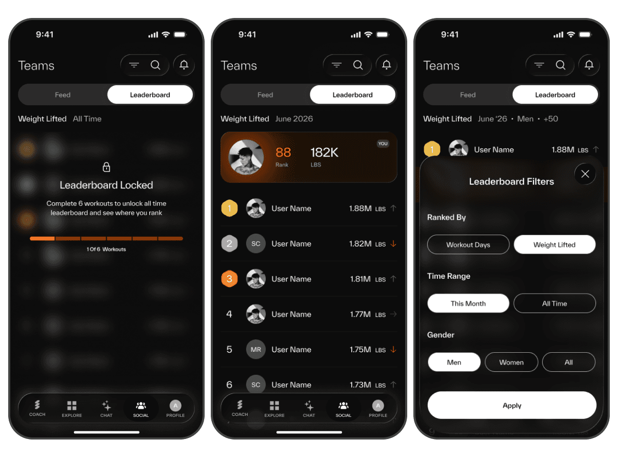
The Leaderboard introduced friendly competition through two core metrics: workout consistency and total weight lifted. Users could compare performance across monthly and all-time views, apply relevant filters, and always understand their own position through a persistent, personalized rank card.
To make competition feel earned rather than passive, the all-time leaderboard remained locked until users completed a minimum number of workouts. This turned access into a progression mechanic while encouraging users to build an initial training habit.
Privacy was treated as part of the product foundation rather than an afterthought. I designed public and private profile states, visibility controls, reporting and blocking flows, and clear rules around which workout information could appear across the platform.
The result was a scalable social ecosystem that extended amp beyond the workout itself, transforming individual activity into shared motivation, recognition, and long-term community engagement.

amp Pro Subscription: Simplifying Purchase, Access, and Activation
amp Pro combines the connected strength-training device with the app’s personalized workouts, AI coaching, and progress tracking. However, access was not always straightforward: users could purchase directly through the app, already own a subscription, or join an existing household as a family member.
I led the end-to-end redesign of the subscription and activation experience, creating a clear path from understanding the value of amp Pro to confirming access and starting the first workout.
The opportunity: The existing journey had to support several subscription scenarios across both hardware and software. New users needed to understand the value of amp Pro before committing, while existing subscribers needed a way to connect their purchase without being pushed through the paywall again.
The experience also had to distinguish between primary account owners and invited family members, each with different activation requirements. Without clear guidance, these dependencies could create confusion and drop-off at one of the most important moments in the customer journey.
The opportunity was to turn a complex entitlement system into a simple, reassuring experience that always made the next step clear.
Key Product Decisions: I designed the paywall to communicate the value of amp Pro through clear, benefit-led messaging focused on real-time form analysis, adaptive resistance, and personalized training. A prominent purchase CTA supported new customers, while “I have an amp subscription” provided an alternative path for users who already had access.
From there, I created dedicated activation flows for the two main subscription types:
- Account owners could confirm their purchase using the email associated with their amp order and securely connect the subscription to the app.
- Family members received clear guidance explaining that access required an invitation from the primary account owner, along with support and account-management options when needed.
Email verification connected app access to the existing subscription while keeping the experience lightweight and secure. Confirmation screens communicated what had happened, what users needed to do next, and when their membership became active.
I also designed the post-activation experience to reinforce the value of the subscription and transition users directly into training, rather than ending the journey on a transactional confirmation screen.
The result was a unified subscription system that supported purchase, account linking, and household access through one coherent experience—reducing ambiguity across key funnel stages and helping users reach their first workout with greater confidence.

Refining Core Product Experiences
As amp evolved, it was important not only to introduce new features, but also to continuously refine the product’s core experiences.
I led the redesign of key user touchpoints to make the product feel clearer, more personal, and more motivating over time. These redesigns focused on moments users returned to frequently, helping them better understand their progress, stay oriented during workouts, and feel the value of a product that keeps improving.
1) Profile Redesign: From Settings Page to Progress Hub
The original profile experience functioned mostly as a settings screen. While it allowed users to manage preferences, it did little to reflect their journey, progress, or identity inside the product.
I redesigned the profile into a more personal and motivating space, one that gives users a clearer sense of ownership over their training and a stronger reason to return.
The opportunity was to transform the profile from a functional utility page into a meaningful destination for progress tracking. Instead of focusing primarily on account and workout settings, the new experience needed to highlight the user’s achievements, consistency, and training history in a way that felt personal and rewarding.
Key product decisions: The redesigned profile brought together the elements users care about most in one place: overall workout stats, streaks, training milestones, personal records, and long-term progress.
A key part of the redesign was the 3D body muscle visualization, which helps users understand how their training load is distributed across muscle groups. This gave users a more intuitive way to track which muscles they had been working, identify imbalances, and make more informed training decisions based on their goals.
The profile also included a monthly workout calendar to reinforce consistency over time, along with trophies and personal records that turned progress into something more visible and motivating.
Rather than feeling like a static settings page, the profile became a more personal progress hub, a place where users could track their development, reflect on their performance, and stay motivated to keep improving.
2) Rest Experience Redesign: Creating More Clarity during the workout
Rest is a small but critical part of the workout flow. It is the moment when users recover, reorient themselves, and prepare for what comes next. In the original experience, this moment did not always provide enough clarity, especially in more complex structures like supersets.
I redesigned the rest experience to improve hierarchy, reduce friction, and help users feel more prepared before returning to action.
The opportunity was to make the rest state more informative and easier to follow. Users needed better visibility into where they were in the workout and what was coming next, without interrupting the rhythm of the session.
This became especially important for supersets, where users were asked to move between multiple exercises without enough preview of the sequence ahead.
Key Product Decisions: I redesigned the core rest screen to create a clearer flow and stronger visual hierarchy, making it easier for users to understand their current state, remaining rest time, and the next step in the workout.
In addition to refreshing the base template, I introduced a dedicated superset preview template that shows all exercises in the superset before the user begins. This gave users a clearer picture of the structure ahead, helping them prepare mentally and physically before starting the round.
By making the next action more visible in advance, the redesigned experience reduced uncertainty and made transitions feel smoother — especially in workouts that required faster switching between movements or equipment.
The result was a more supportive and transparent rest experience that improved workout clarity without adding complexity.


